Rust and Rose: Two Ways to Pair Warm Colours
Rust and rose can read as quiet and tonal or crisp and vivid. Use lightness and colour intensity to choose the warm pairing that suits your outfit.
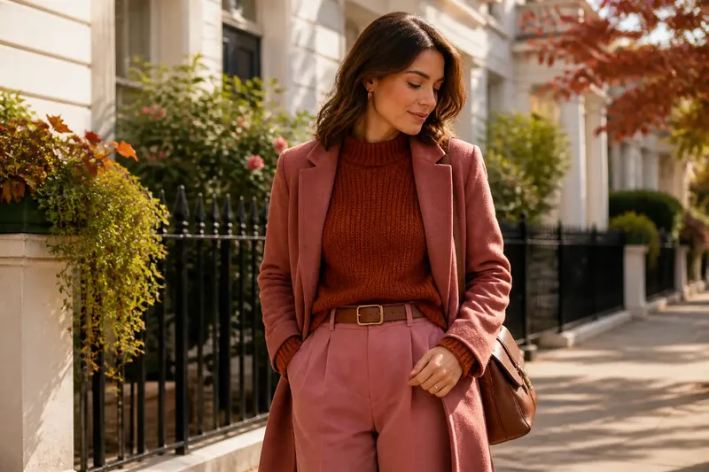
You pull a rust sweater from the chair and set it beside a rose skirt. Together, they look either quietly related or unexpectedly lively, depending on the shades. Rust and rose are useful precisely because warmth alone does not decide how a pairing feels. Lightness and intensity do much of the work.
For rust and rose outfits, the central choice is whether to keep those qualities close or let them diverge. A tonal pairing stays near in depth and softness. A higher-contrast pairing separates the colors through lightness, saturation, or both. Neither is inherently more polished; each tells a different visual story.
What makes rust and rose work together?
Rust usually carries an earthy red-orange character, while rose can range from dusty pink to clear, bright pink. Their shared warmth gives them a point of connection, but their undertones still matter. A rose with a peach or brown cast tends to sit easily beside rust. A cooler, bluish rose may feel more distinct, which can be appealing if that separation is intentional.
Look at the colors in the same light, preferably daylight near a window. Indoor bulbs can make a muted rose look browner or push rust toward orange. You do not need to identify a precise undertone; notice whether the colors seem to lean toward one another or pull apart.
Fabric changes the impression, too. Brushed wool, corduroy, and matte cotton soften color. Satin or polished leather reflects light and can make the same shade appear sharper. If the color relationship feels too forceful on a smooth fabric, a matte texture may calm it without changing the palette.
What is a tonal rust and rose pairing?
A tonal pairing keeps the two colors close in lightness and intensity. Think of muted rose trousers with a soft, brown-leaning rust knit, or a rose blouse under a faded rust jacket. The colors remain distinct, but neither insists on being the focal point.
This approach works well when you want the outfit to feel settled and cohesive. It is also forgiving when the shades are not exact matches: close color character matters more than identical dye lots. Add a neutral such as cream, cocoa, or warm gray if the outfit needs a visual pause, but keep it to one area rather than dividing every garment with another color.
Texture can supply the small differences that a tonal palette deliberately avoids in brightness. A ribbed sweater beside smooth trousers, for example, gives the eye something to register without turning the colors into a contest. Let one piece have a little more texture, then leave the rest uncomplicated.
How does a higher-contrast combination change the look?
Higher contrast comes from a noticeable difference in lightness, intensity, or both. Pale rose with deep rust creates a clear light-dark split. A vivid rose beside a subdued rust contrasts in intensity instead: one color appears lively, the other grounded. The outfit feels more graphic, even though both colors remain warm.
Imagine you have a deep rust coat and a bright rose scarf. If the scarf occupies a small area near the face, it becomes the lively accent while the coat keeps the outfit anchored. The expected visual result is a stronger focal point without making every part of the outfit equally bright. A pale rose shirt under a dark rust cardigan uses the same principle on a larger area, so the contrast reads more openly.
When both colors are strong and similarly bright, the combination can feel busy. You can reduce that effect by making one color smaller, choosing a less saturated version of one shade, or adding a quiet neutral between them. The goal is not to suppress contrast but to give the eye a clear place to rest.
How should I choose lightness and intensity?
Start with the impression you want, then compare each garment against the other rather than judging it alone. Lightness describes how pale or deep a color looks. Intensity describes how clear or muted it appears. A color can be light but muted, such as dusty rose, or deep but vivid, such as a saturated rust.
- For a quiet pairing: choose shades that are similarly muted and not far apart in lightness.
- For a clear focal point: keep one color restrained and let the other be brighter or lighter.
- For a more dramatic split: pair pale rose with deep rust, or a vivid rose with an earthy, subdued rust.
- If the colors compete: reduce the area of the brighter garment or bring in a warm neutral.
- If the outfit looks flat: vary the texture or introduce a clearer difference in lightness.
These are visual tendencies, not rules. Skin tone, personal taste, garment shape, and the setting all affect what feels comfortable to wear. A color that looks bold in a large coat may be easy to wear as a narrow belt or small bag.
Which fabrics and accessories help the pairing?
Matte fabrics make close tonal combinations feel especially calm, while a subtle sheen can sharpen a higher-contrast one. A rose silk blouse with rust trousers, for instance, has more visual movement than the same colors in brushed cotton. If you want the colors to stay understated, choose fabrics with similar surface qualities.
Accessories can either connect the shades or emphasize their difference. A tan leather belt or warm brown shoes can bridge rose and rust without matching either garment. Cream jewelry or a scarf can lighten a deep combination; a dark brown bag can steady a pale one. Metal finishes also have a role: brass and gold usually echo the warmth, while silver makes a cooler, cleaner interruption.
Keep the number of additional color signals modest. If the clothes already create a strong contrast, a neutral bag and simple shoes let that relationship remain legible. If the outfit is tonal, one accessory with a little sheen or a deeper value can keep it from reading as a single block.
What should I ask before wearing rust and rose?
Does rose have to be warm to pair with rust?
No. A cooler rose can create a deliberate temperature contrast with rust. Keep the rest of the outfit simple if that difference is the feature you want noticed.
Can I wear rust and rose in the same intensity?
Yes. Similar intensity usually makes the pairing feel more coordinated, especially when the shades are also close in lightness. Distinct textures can keep the result from looking too uniform.
What neutral works best with rust and rose?
Cream, warm gray, cocoa, and tan often sit comfortably beside both colors. Choose a neutral that supports the overall lightness: cream opens up a deep pairing, while cocoa gives pale shades more weight.
How can I make the pairing feel less bold?
Use muted shades, keep one color to a smaller area, and choose matte fabrics. A neutral layer between the two colors can also soften the transition without removing either one.
How can I tell whether the balance feels right?
Look at the outfit from a little distance, not only at the garments in your hands. Notice which color catches your eye first and whether that matches your intention. If the contrast feels too strong, reduce the brighter color’s area or soften its intensity. If the pairing seems dull, add a clearer light-dark difference or change one fabric’s texture.
Rust and rose outfits do not need a third color to make sense. Their character comes from how close or far apart their lightness and intensity sit. Choose the tonal version when you want the colors to speak quietly together; choose stronger contrast when you want one shade to lead. A small change in shade or surface can move the pairing between those two moods without changing the basic palette.